
Verizon Buss 2.0
Imagining an innovative & robust sales tool for incredible bulkvolume quote-building and catalog management
- UX Design
- Responsive Web Design
- UX Strategy
Imagining an innovative & robust sales tool for incredible bulkvolume quote-building and catalog management

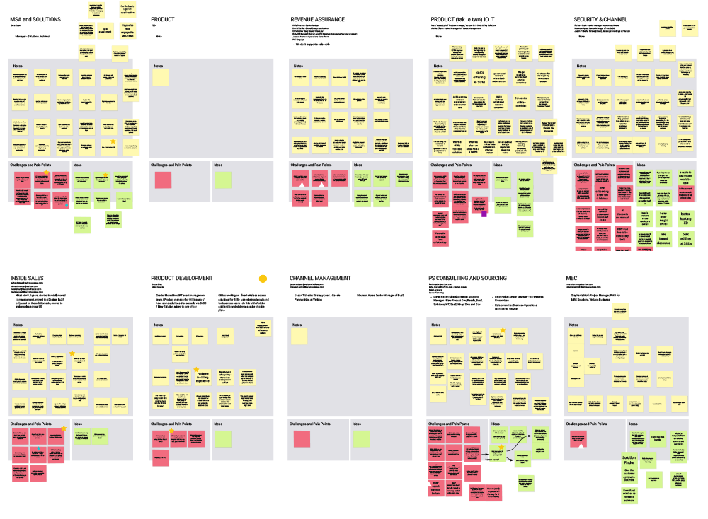
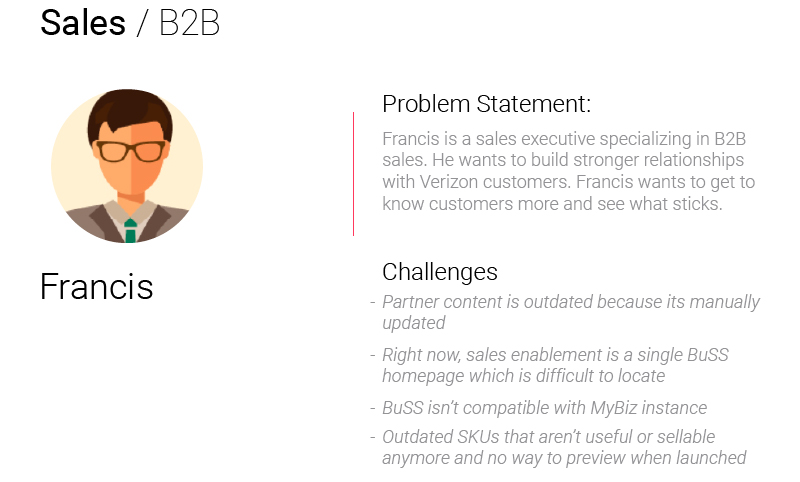
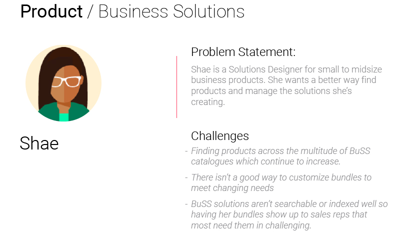
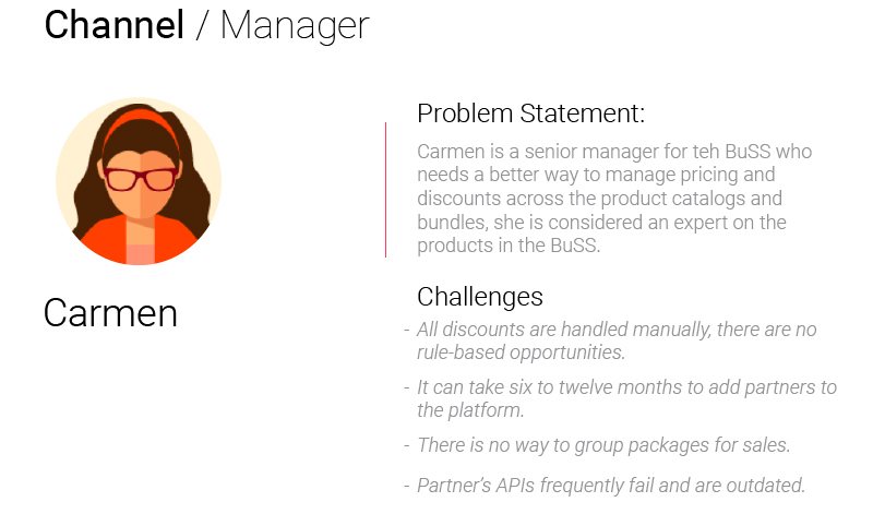
There wasn’t a clear problem statement from the client, just that there were big structural issues. So stakeholder interviews seemed like a great place to start to gather information directly from those most impacted. We conducted 14 interview sessions with more than 20 stakeholders and identified 12 types of users. These were then distilled down into 3 personas who represented clear user paths we could design for.

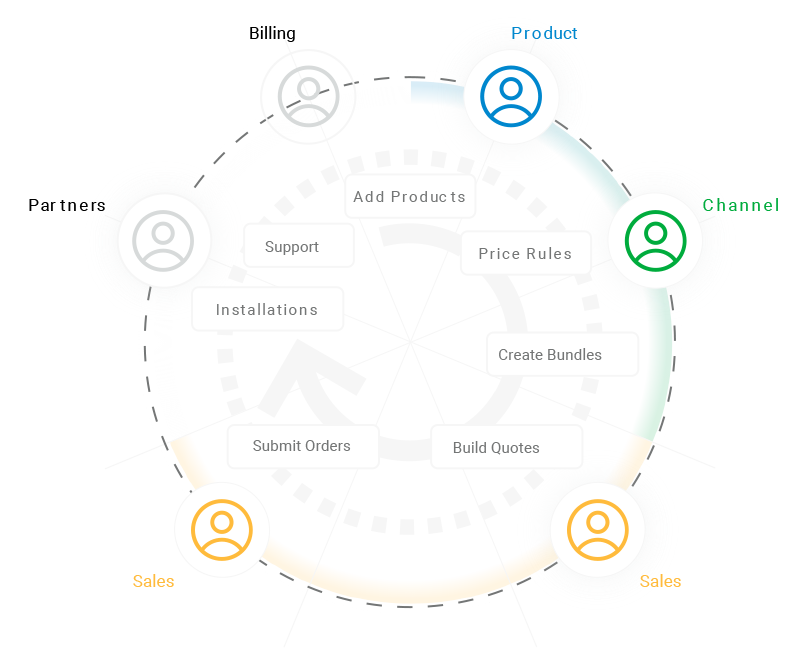
Starting with an outline of the whole user ecosystem so that the personas we’re really interested in can be shown in their natural context provides a really valuable perspective.
A fast internet connection is crucial to access: government services, job opportunities, and communicate with others online. It is also becoming essential for the next generation as they learn and need it to access educational materials and do homework. Those without home internet access are quickly becoming cut off from essential tools and services or stymied by the limited productivity of small screened mobile devices.

Our interviews and analysis of the existing systems provided a huge amount of information but we needed to sort it into useful formats that could provide meaningful direction to future designs. Classic tools like experience maps provided a great way to start to filter all these inputs.
Through the course of developing these Personas, we identified key workflows that any redesigned system would need to address. Among them: On-boarding new vendors, products, and product bundles. Educating salespeople on the products that they’re expected to sell. Giving salespeople access to tools to help them optimize sales opportunities. Building and tracking quotes
An experience map can be simple, but we designed this one to be a billboard that lays out all the functionality of our 5 core user groups representing one powerhouse platform that delivers every function.
As planned, we didn’t just want to do exceptional research, we wanted to make each asset into an exhibition of value and quality. The team leaned on our infographic design skills for this piece. Our journey map is a foundation for the analysis of all our team’s collective research which is going to serve 3 huge purposes for us.
We chose to do the impact/effort matrix because this diagram provides many insights in just one exercise. From this diagram we can extrapolate which features provide the most value to the user which tells us how prevalent those features should be in our designs and especially our dashboards. Also, this diagram tells us how to group functionality if we choose to implement a multiphased development effort - since this is such an ambitious project that’s a very likely scenario.


Because we created our journey map so early in the process, the stories we documented are truly unbiased. They are universally true of the user’s needs before we’ve had the opportunity to speculate. Many very important functions happen offline - but they are still part of the journey and will still inform the functionality of our app for the strategists designing it. Because we had such a strong foundation to work off of we were able to ideate with a great deal of confidence.
We decided to spend time identifying the core themes of our stakeholder interviews because there were so many innovative ideas. By breaking out each theme we were able to do our comparative analysis for each theme instead of at-large which gave us some amazing insights. This allowed us to dive into the design phase with confidence that we were designing towards something of real value.

4 user stories guided our creation of over 30 key wireframes and led to a high-fidelity designed clickable prototype.
Just some of the highlights:
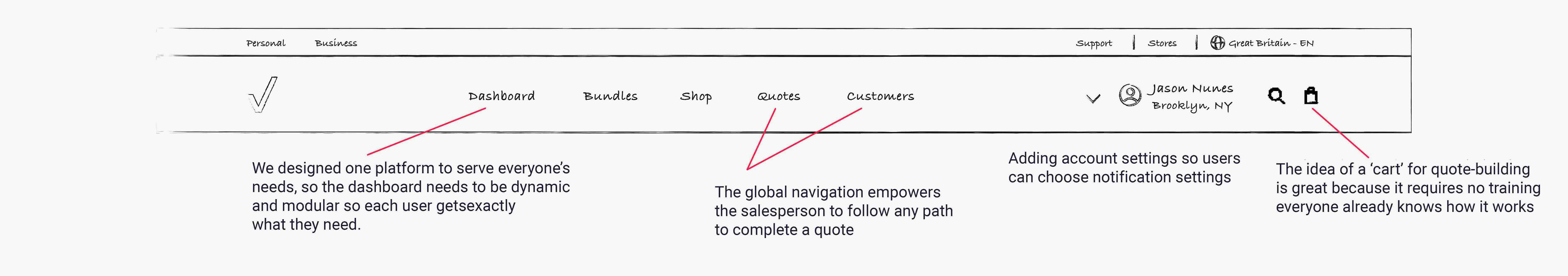
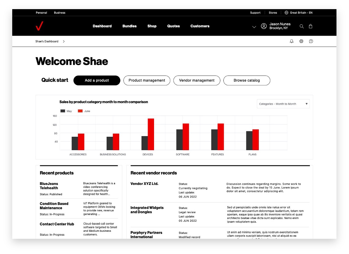
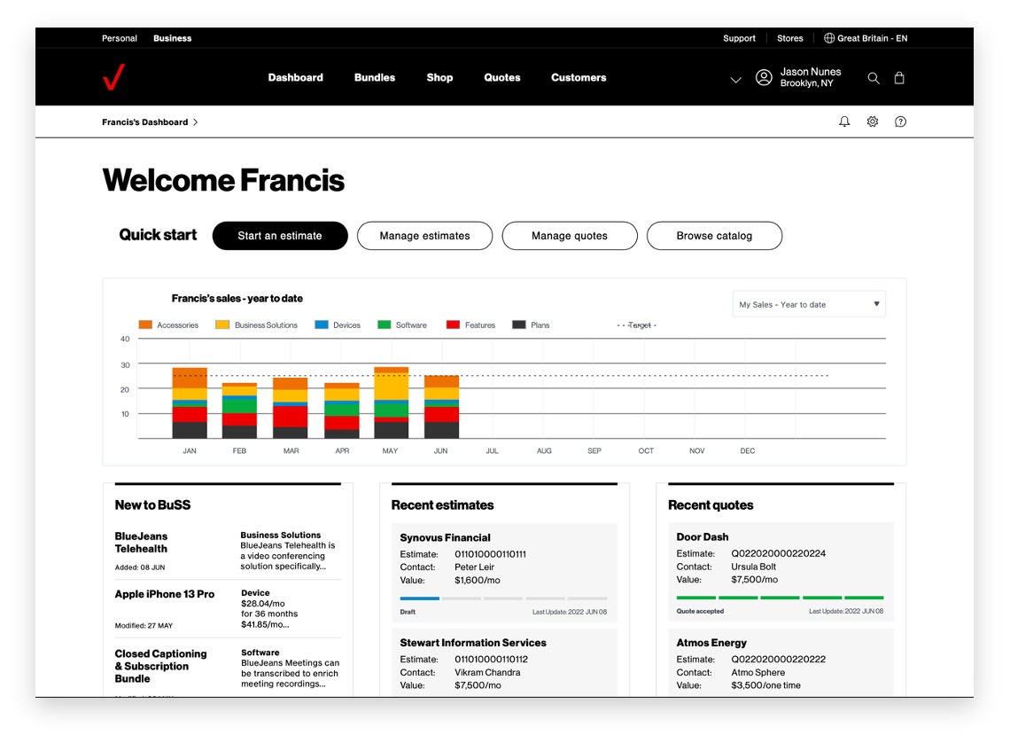
Personalized dashboards give instant access to workflows and information
Consolidated vendor and product management interfaces
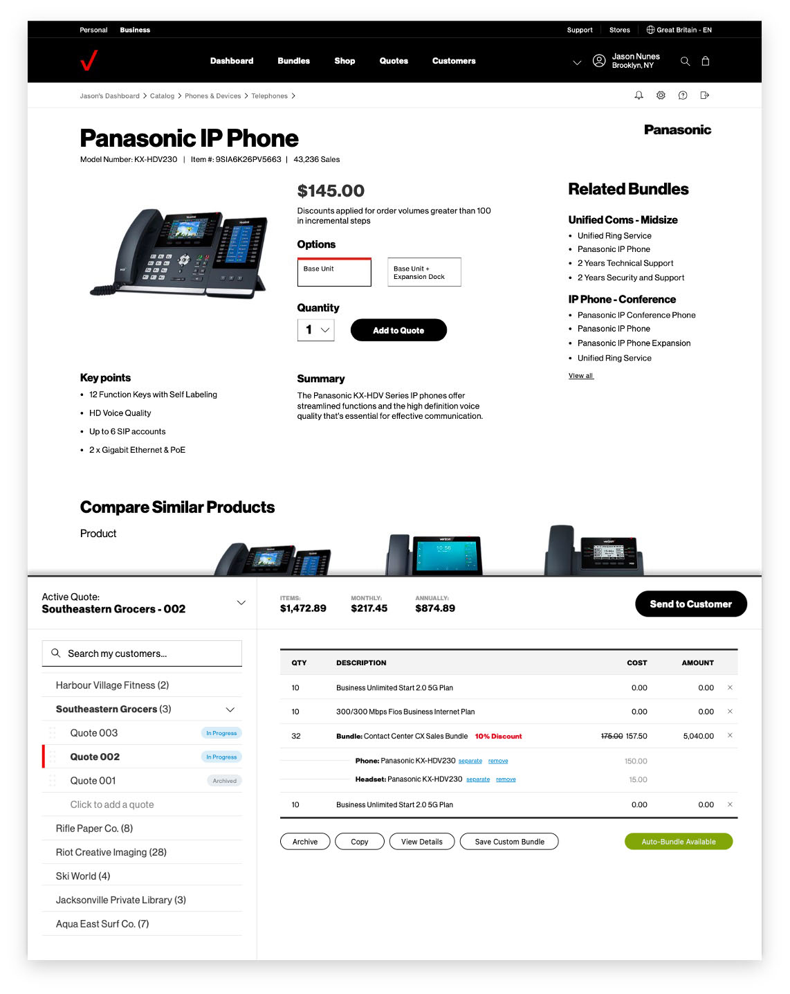
Access to the entire BuSS catalog with one click
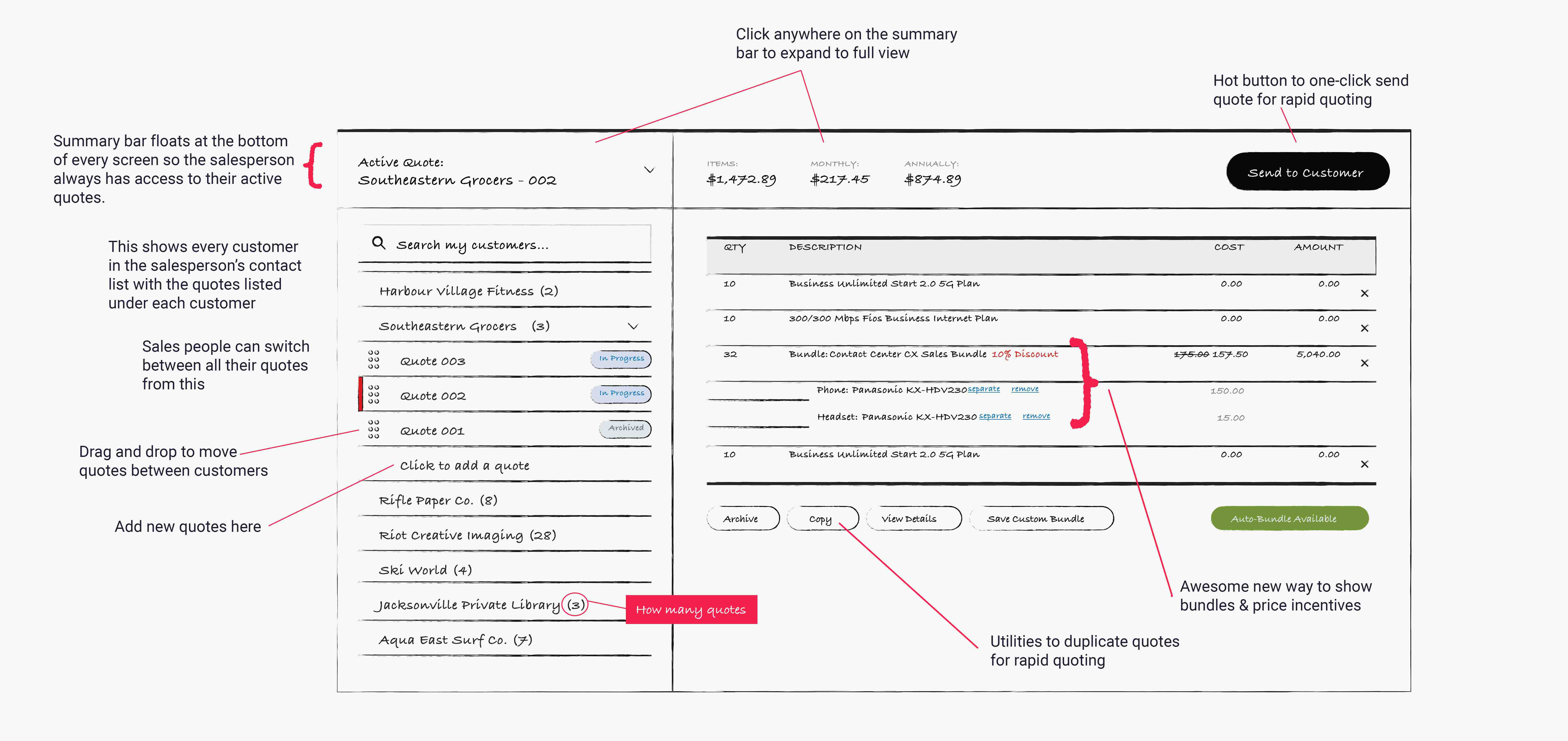
Always accessible docked quote builder interface
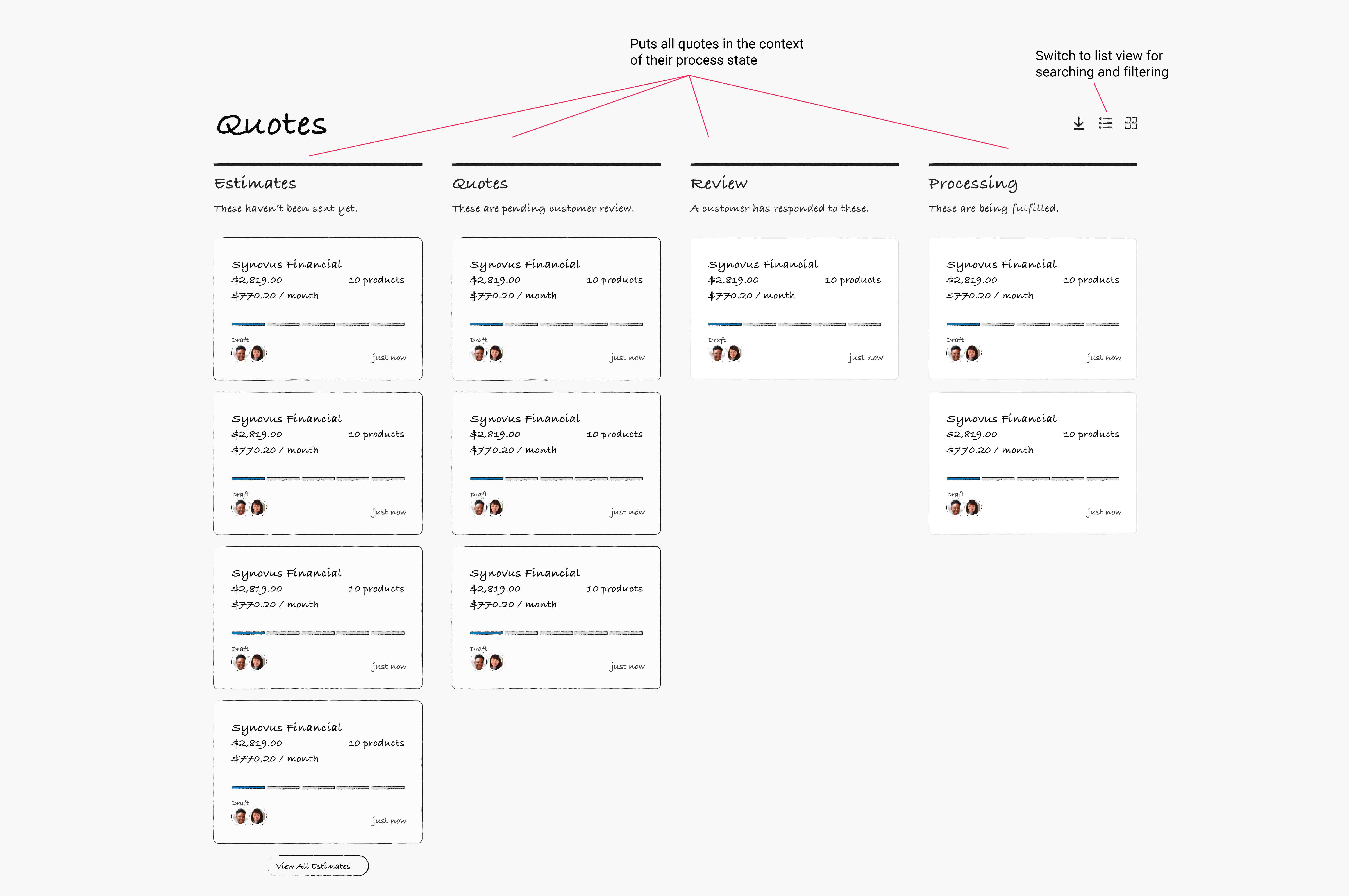
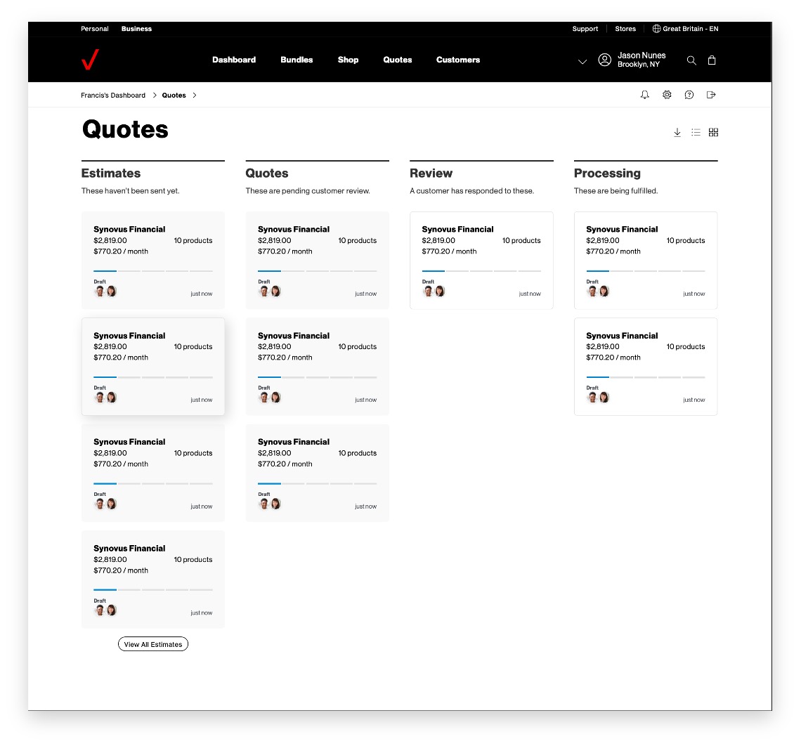
Drag-and-drop boards for managing and monitoring quotes from creation to fulfillment

The client was a great partner throughout the process and we got fantastic feedback when they were presented with the final design solutions. Verizon is now holding internal talks to assess how to engage the team further to take this framework and invest in making it a reality. There are several avenues they have asked us to see if we can extend this solution to including post-order fulfillment and support processes.