
MARCHMADE
A new website to reposition the firm's place in the industry.
- UX Design
- Copy Writing
- Content Creation
- Front End Coding
A new website to reposition the firm's place in the industry.

To begin, I started with a few questions: What was the current website lacking? Who was the website for? What story is MARCH trying to tell? Sitting down with the stakeholders it became clear that there was a lot of frustration in how the current site was structured, its narrow scope of work displayed, and its inflexibility.

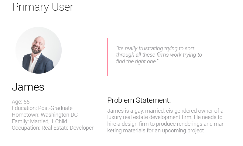
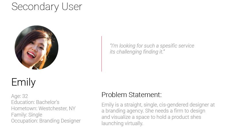
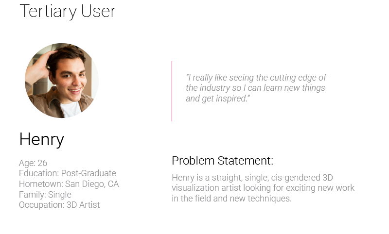
I conducted interviews with the partners of the firm and other stakeholders to understand what they would like to gain from the redesign, and what specific things were important for them to see and highlight on the new site. We narrowed in on a set of priorities for the design and who it should be targeting.
There was a repeated sentiment that the existing site failed to capture the range of the firm’s design and visualization abilities and expertise. It also had no way to show off the software platform that had been developed in house and was becoming a major source of revenue
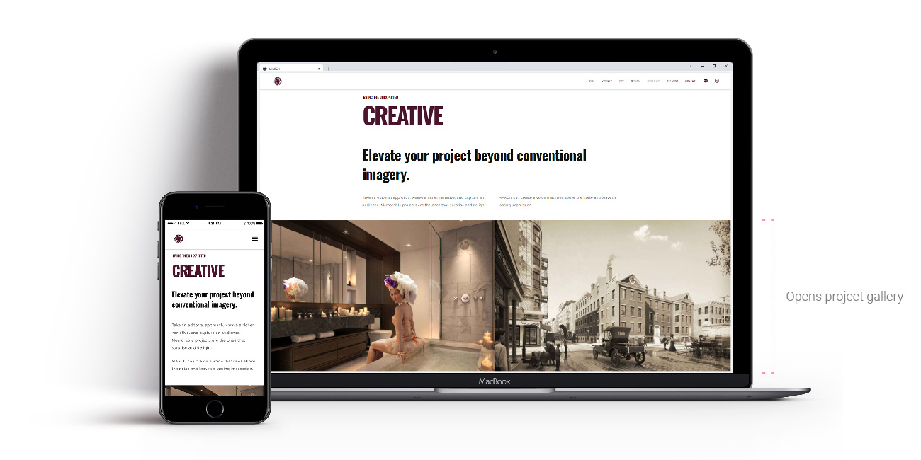
In surveying industry peers online presences it became clear that there was a lot of variety in approaches but most had a few things in common that we found ineffective: 1) really deep portfolio pages with a comprehensive collection of the firms work. No client or agency we talked to ever spent more than 5 minutes looking through these catalogs. 2) Overly technical content, several sites showcased “making of” pieces that seemed like they were geared toward other peers in the industry and not potential clients. What I did really like were sites that emphasized videos and motion content, it felt very engaging and impressive.

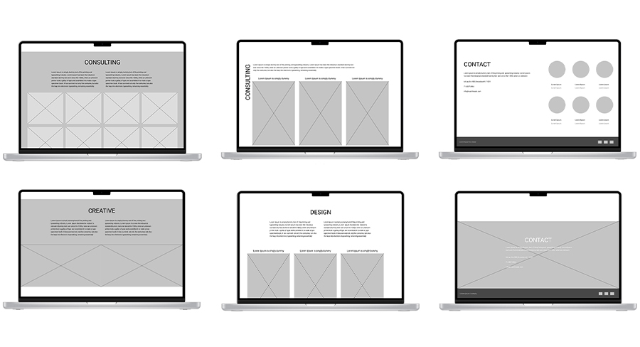
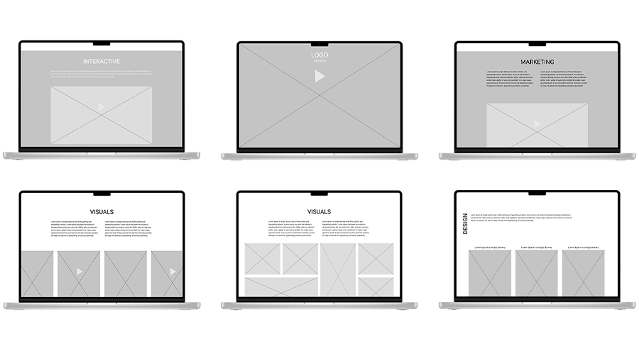
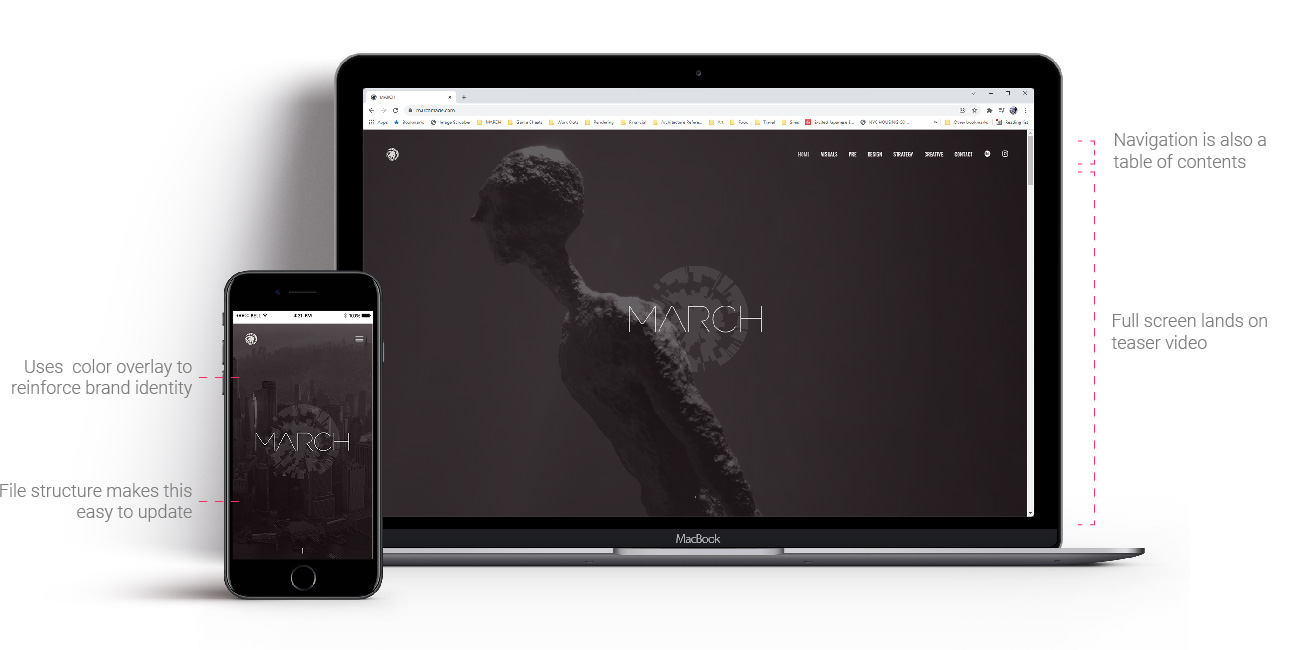
Before I started getting into layouts or wireframes I wanted to structure the site through diagrams to better understand what was needed. Conceptually the idea of a single page site divided into chapters really fit the firm's needs and aligned really well with the idea of telling a story to visitors as they scrolled down and explored. MARCH has a really comprehensive Behance page already so it wasn’t so important that a comprehensive portfolio of work live on this site.
Research showed that most people don't click deeply into website portfolios when browsing and doing casual surveys. By keeping most of the content upfront and using it as a showcase instead of a comprehensive portfolio it can be more manageable to understand and highlight the very best work.
Organizing the content into “chapters” around a theme rather than by typology or market allowed for more focused storytelling and allowed the best work from lots of projects to shine.
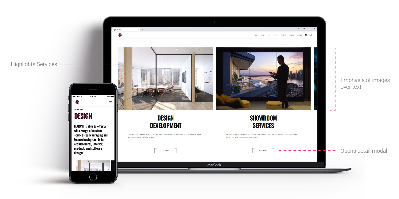
By organizing the site around the services that MARCH provides instead of around project type or project name like a traditional portfolio the firm can better advertise the many offerings that clients may not be aware of.

I started by sketching out what I thought the needs of each chapter were and how that information would best be displayed. I then tested them in various orders to better understand how the different sections would relate to each other in sequence and build a narrative.

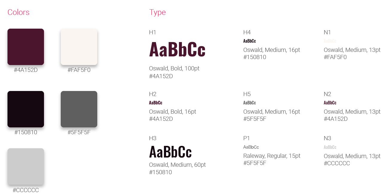
It was especially exciting getting to assemble and really dive deep into the creation of the final site and I was responsible for everything from UX design, to front end coding to content creation. It was important that the firm's existing branding translated into the new design and I incorporated the colors and logo/mark throughout the design while refreshing some of the graphic styles. It was also crucial that the site be easily updated, so a php script that could read spreadsheets started to become the basis for a future CMS. This was my first time doing any serious front end coding and I very much enjoyed it, understanding that part of the process made me a much more capable designer. The firm didn’t have the bandwidth or internal expertise to build out a website from scratch so I did research and found a set of responsive bases and plugins online that had the components that I needed and used that code to build out the final product customizing it and layering my own styling on top.


After we launched the new site march has seen continuing positive movement in several metrics. We are particularly focused on maximizing the amount of time users are spending on the site and how many are returning.
This was an incredibly interesting project to work on, I learned so much as a designer both in terms of user experience and information architecture, but also about front end coding. There are still features that I would like to implement that weren’t possible in the first version due to time and technical constraints but part of the site’s design was to ensure that it was easily updatable and become a sort of living document showcasing MARCH’s best and most exciting work.