Exploration
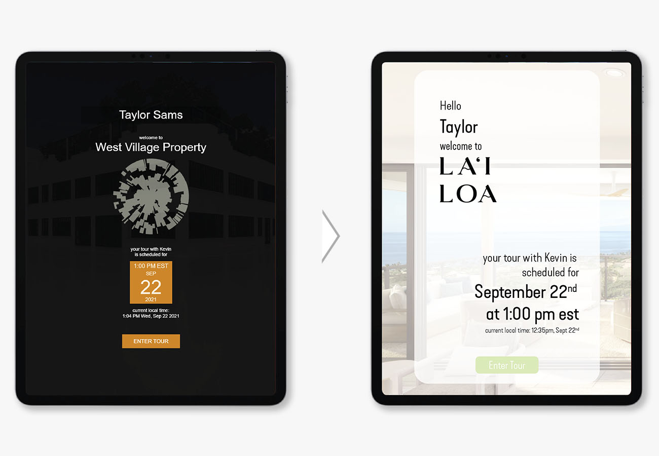
There was an existing early interface and ux set up, so I was able to collect and compile feedback from coworkers and clients who had been using the existing version to find out what they found successful, frustrating and if they had any ideas about new things they would like to see.
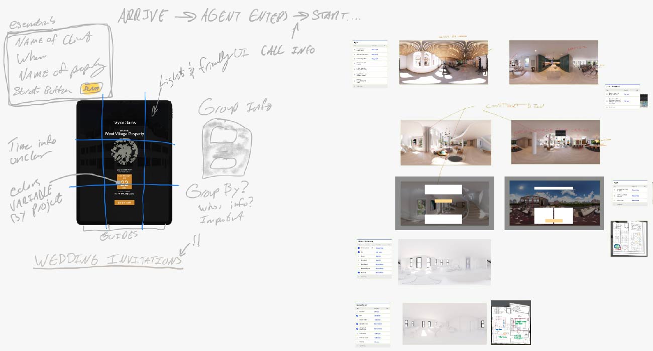
Intitial Brainstorming and Information Gathering
Background on 360 Content
360 content is everything from spherical interactive images (like google street view) to fully stereoscopic immersive headset driven experiences (like oculus rift)
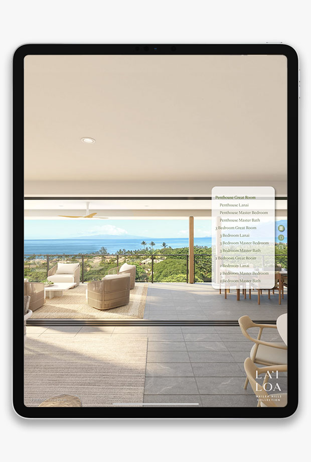
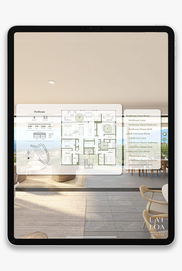
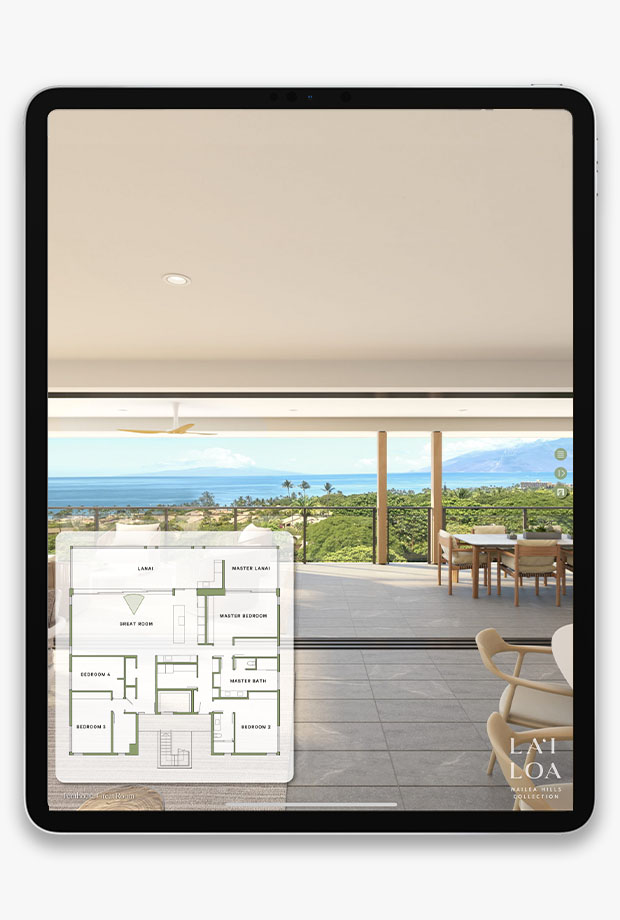
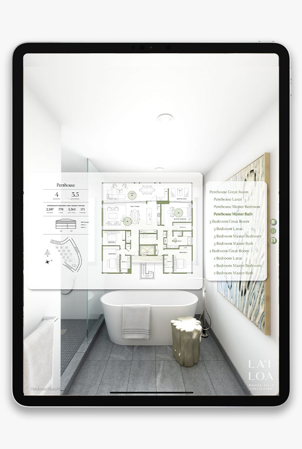
Spherical image navigation hasn’t been natively supported in browsers and it was hard to connect other information to the spaces users were viewing. Things like floorplans and position guides help orient them. There also hasn't been good integration of other data like pricing or square footage.
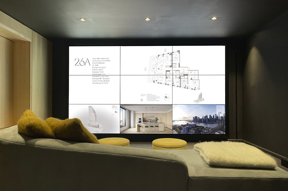
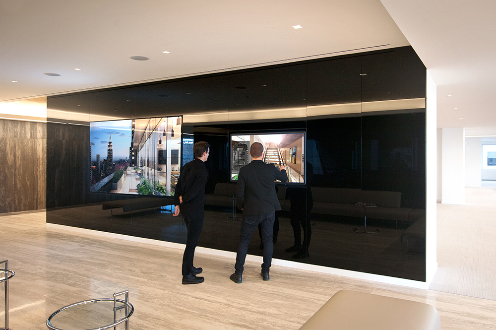
It’s been used to host both rendered and captured content for a variety of clients; including luxury residential sales, office space conversions, and architectural design development.
The content adjusts per screen in really interesting ways, navigation on a touch screen works very differently than in a VR space where we have an outside controller linked to serve information to users.
It works in two modes. In one a user can guide themself though the content by tapping on spaces they’d like to see either from a list, on a plan, or in the 3D space. In the other a presenter uses a CMS controller on a device like an iPad Mini to serve content to a series of displays in a guided tour.