
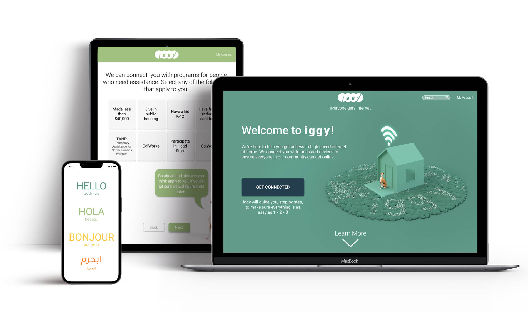
iggy
everyone gets internet
A platform to link people without broadband internet at home to the resources to connect them and ensure everyone in your community has access to the services and tools of the web.
- UX Design
- Responsive Web Design
- Branding
A platform to link people without broadband internet at home to the resources to connect them and ensure everyone in your community has access to the services and tools of the web.

The big question: who's not connected in our communities at home and why? I collected data from white papers and online journals to figure out who these people were and what barriers exist for them so that iggy can meet them where they are and address their specific needs.
The United States has quickly adopted internet use: in the year 2000 1% of Americans had a broadband connection at home, by 2021 that had risen to 77% 1 and the way that we access information and services had been drastically altered. However there is a gap remaining and 23% of households are unable to access what has become a crucial piece of infrastructure.2

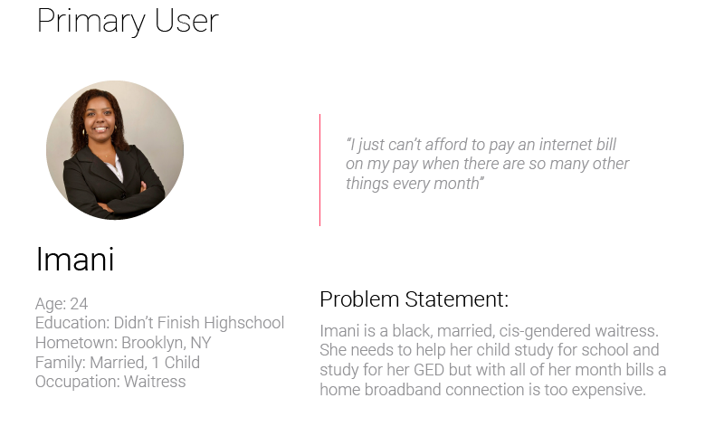
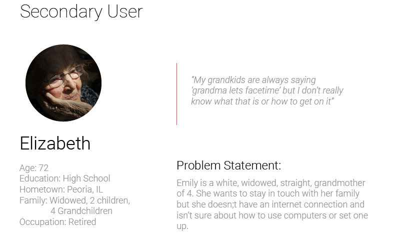
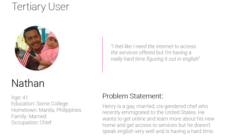
This is referred to as the digital divide and conservative estimates suggest that it effects about 21 million people.2 Three demographic subgroups make up the majority of this group and have a significantly lower adoption rate than others in the same category. They are: people who make less than $30,0001 per year, 57% adoption vs 92% for those who make $75,000 or more; those who did not complete high school,1 46% adoption vs 94% for those who hold a college degree; and those over the age of 65,1 64% vs those aged 18-49 at 86%. All other demographic variables including race, gender, and sexual orientation hew to similiar high levels of home internet adoption across groups.
Adults who make less than $30,000
Adults over the age of 65
Adults who did not complete high school
One of the most common reasons Americans cite for not subscribing to broadband at home is cost: 45% of adults say the monthly cost is too expensive1 and 40% say the cost of a computer is too high. A portion of this group has turned to smartphones as a way to access the internet instead and are considered “smart-phone only” internet users. Smartphone adoption has increased rapidly in the last decade and in 2017 smartphone ownership surpassed home broadband connections.
 Smartphone does everything they need
 Monthly cost is too high
 Have other options
 Service is not available
 Cost of computer is too high
 Other reason
A fast internet connection is crucial to access: government services, job opportunities, and communicate with others online. It is also becoming essential for the next generation as they learn and need it to access educational materials and do homework. Those without home internet access are quickly becoming cut off from essential tools and services or stymied by the limited productivity of small screened mobile devices.

Based on the research it was becoming clear that the main function of the platform would be to connect users with funds to help them with the monthly cost of a broadband connection and home computing devices. However, one of the biggest and earliest questions that came up was how to reach these users on a digital platform when they don’t have easy access to digital services at home.
How might we link people who need financial help with government subsidies?
How might we reach out to community members, especially the elderly?
How might we connect people with home computers/devices that can’t afford them.
How might we place this resource in a public place for people to access securely.
Users of the platform will need to access it on whatever device is easiest and most available for them. For the elderly who are visited by a community outreach volunteer this could be a tablet, while for a smartphone-only internet user who wants to get connected at home this could be a dedicated mobile app.

As I ideated around the foundational goals of the project I put together: user personas, user journeys, and empathy maps to build out my understanding of where and how the design needed to function and how to meet users where they were. I developed low-fidelity prototypes to test parts of the user flow before bringing it all together into the final set of designs.
It was becoming clear that the main function of the platform would be to connect users with funds to help them with the monthly cost of a broadband connection and home computing devices. However, one of the biggest and first questions that came up was how to reach these users on a digital platform when they don’t have easy access to digital services at home.
I broke the users into 3 types of access: smartphone only, for those who have smart devices but no home service; community outreach for those who might need volunteer help to get started; and public space access for people who could be directed to it in places like libraries or community centers with shared computers and devices.
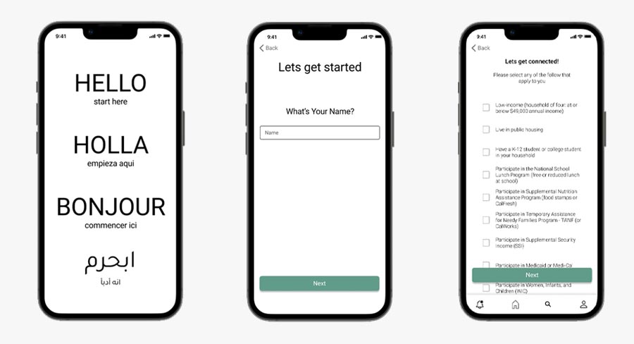
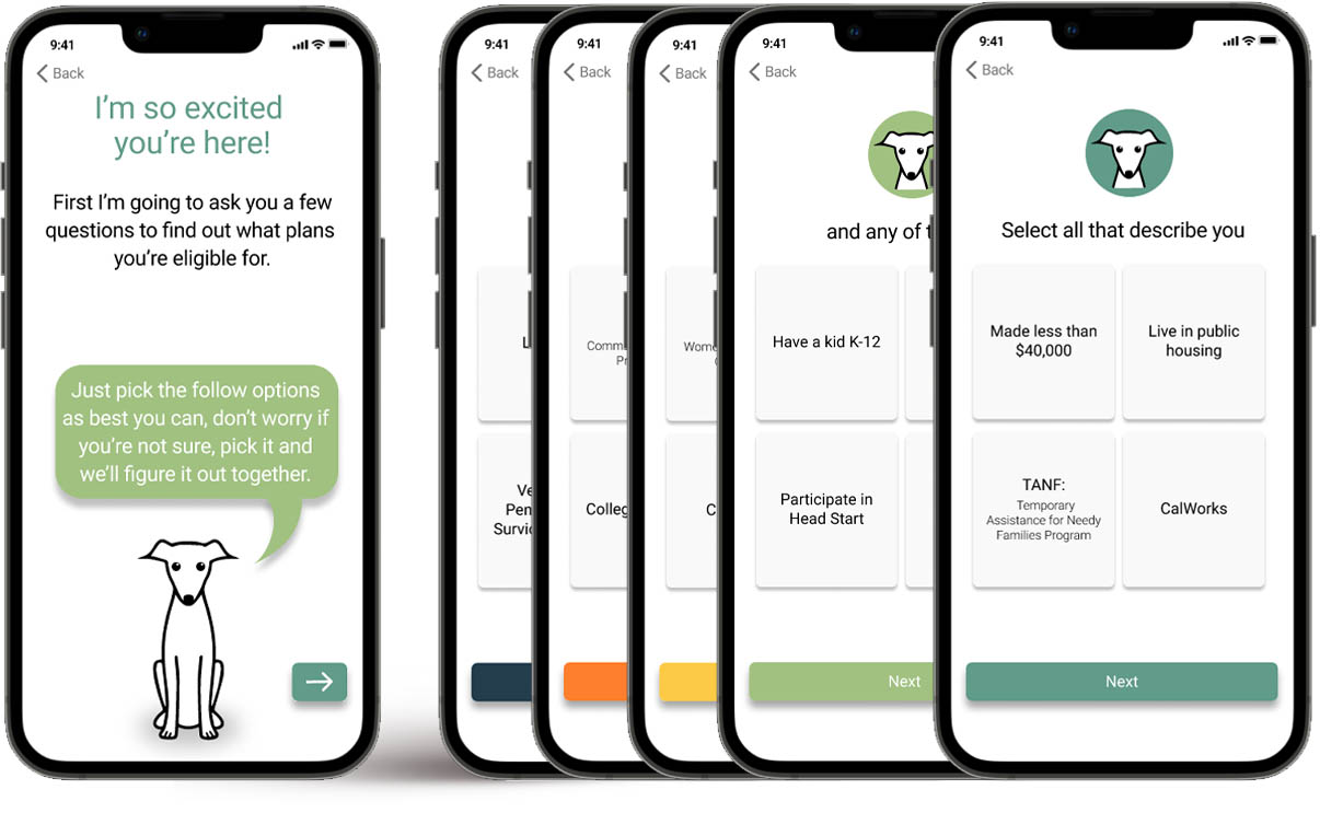
I iterated through several paper wireframes testing different ways to learn about users and use that information to filter subsidy programs and then present them with solutions that they qualified for. It was interesting trying to build trust and guide users without being overly prescriptive and wordy.
A large portion of the users coming to this platform won’t have a great deal of digital literacy. The dedicated mobile app is focused on the 15% of users in the group who are defined as “Mobile Internet Access Only” They only access the internet through a personal smart device. By keeping the design to mobile OS design systems it feels very familiar and reduces opportunities for confusion.
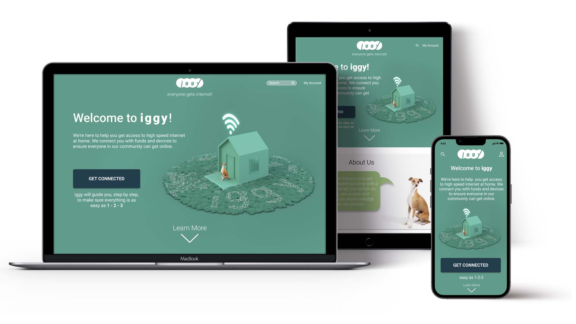
The visual appearance of the platform needed to feel welcoming and energetic so I used warm and bright color complements to create a pleasant and encouraging environment. It was also important that text and interaction on the platform strike an encouraging and friendly tone knowing that this process could be a source of stress for many users. The content itself needed to try and diffuse some of those negative feelings. Users should be greeted by an interface that feels clean and unstressed.
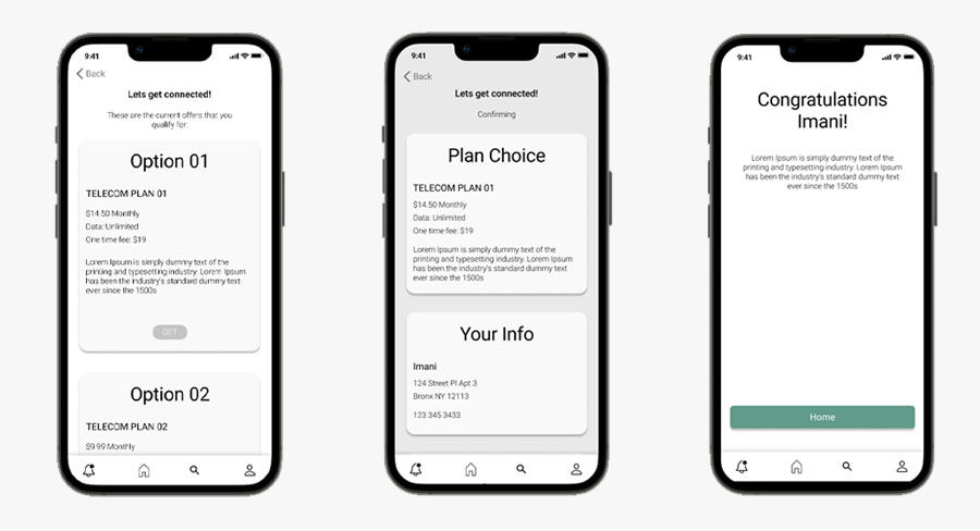

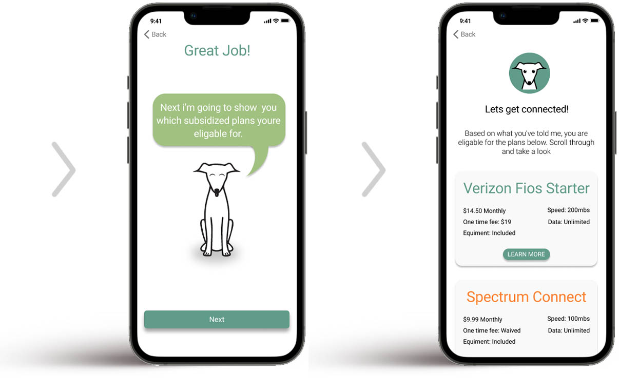
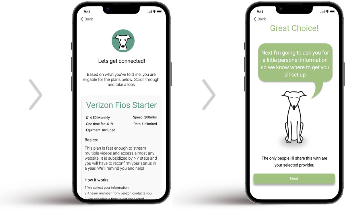
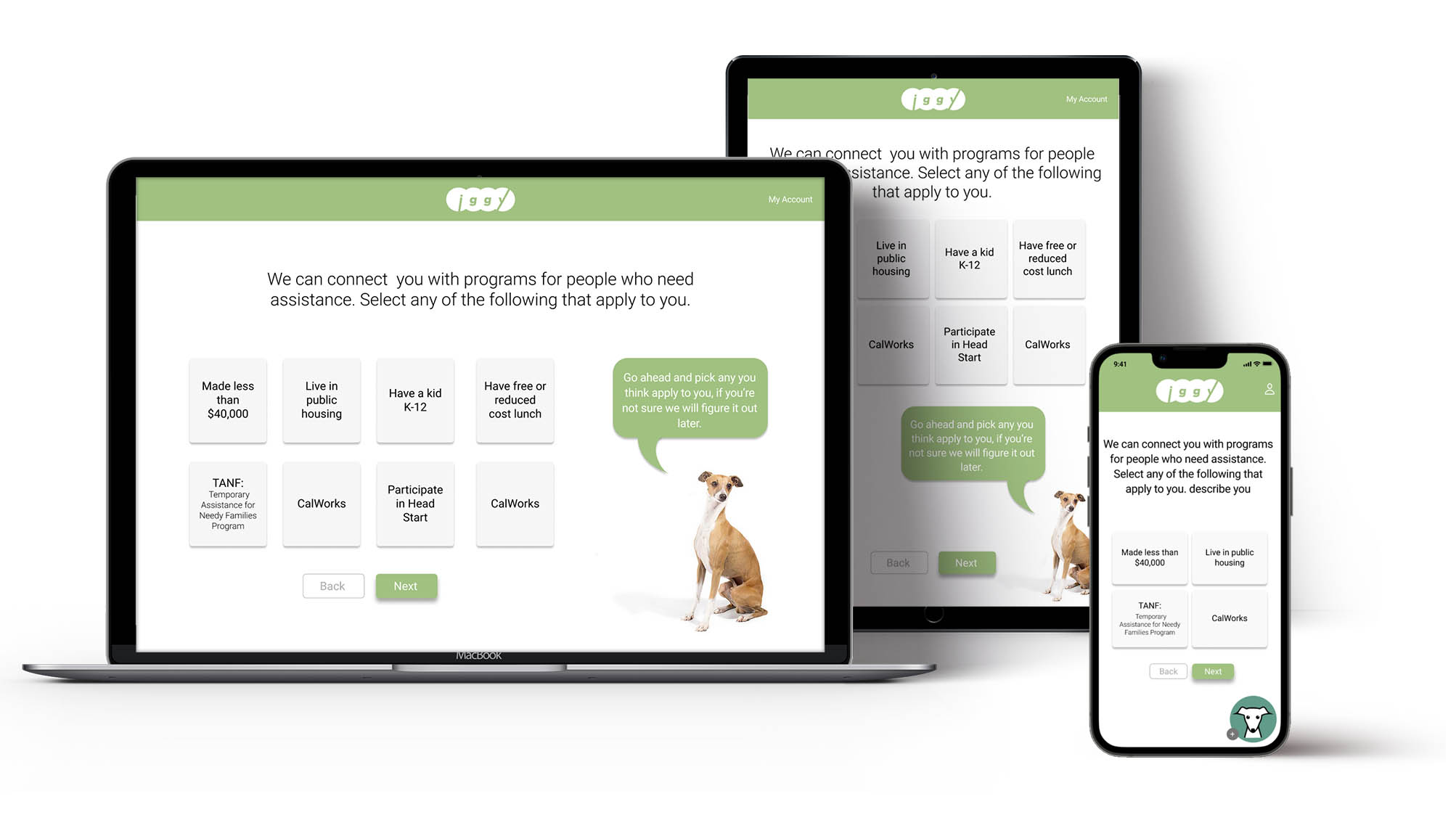
Usability studies conducted with early digital prototypes revealed some really interesting insights that informed the direction of the refined design solution and created some really exciting opportunities. One of my favorite changes was the addition of a little mascot. Many older users wanted more guidance and clarity about what was happening on each page and each step of the process, so I created this little character that can guide them through each page and explain things as they go.
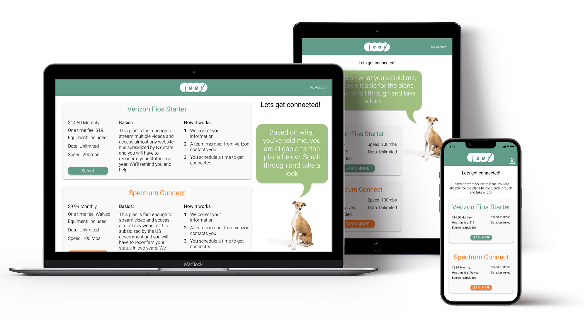
In the early prototypes many users were overwhelmed by the amount of information on the qualifying conditions page. By breaking it into a series of pages that group options by type it was much easier to navigate. Users were also intimidated by the “GET” button at the end of this section, they felt it was too final and permanent. By changing it to “LEARN MORE” users felt more comfortable selecting plans and exploring them more. Upfront information was also reduced to essentials and the cards expand to show more when users select them.
Testing showed that less digitally literate users benefited from a mascot that guided them step by step through the process.
Older users almost never scrolled down pages unless prompted so information is kept to a single screen.
The dedicated mobile app uses OS interface standards so that users with smart devices are familiar with the digital space already.
The web version of iggy aims to still feel friendly and cheerful even though it might not always have the same personalization opportunities as the dedicated mobile app. It has a slightly different user flow because it asks for less information upfront and forgoes creating an account at first to allow users more opportunity to explore and learn before going to the main user flow.

Iggy still has lots of room to grow and improve, there are several scenarios I would like to tackle in order to reach additional people and more testing is needed to understand the impact of additional changes.
This is such a fun and gratifying project to work on and the usefulness of a platform like this in my community gives me so much energy as I do the work. I’ve also learned so much throughout the process from talking to people who could benefit from a service like this to experimenting with new ways of designing user experiences and understanding their impact. I’m very excited to continue working on this project.