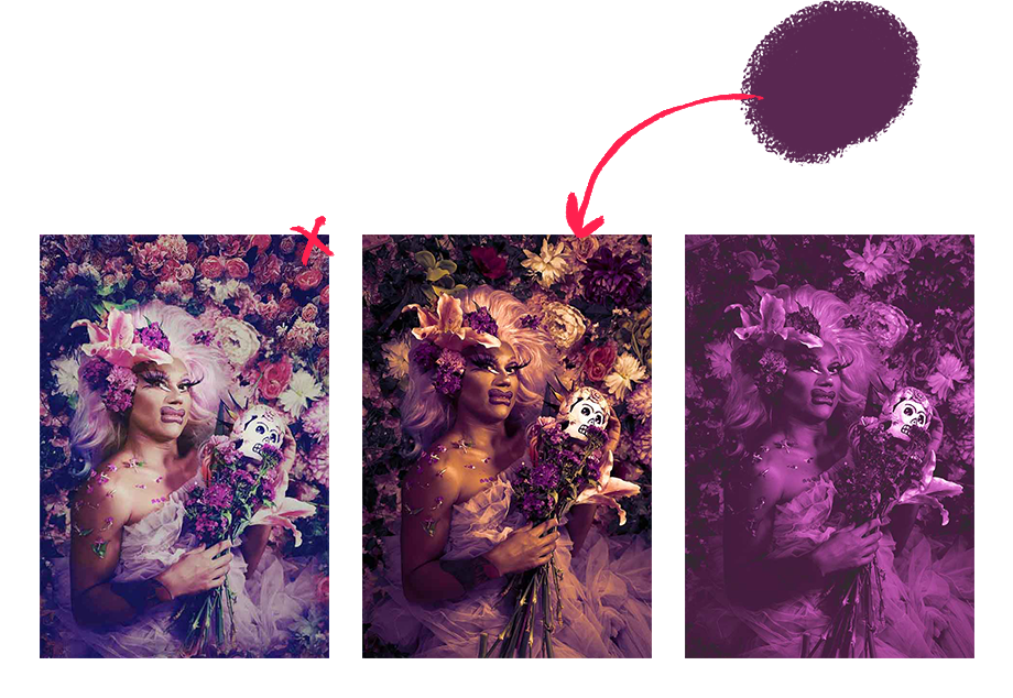
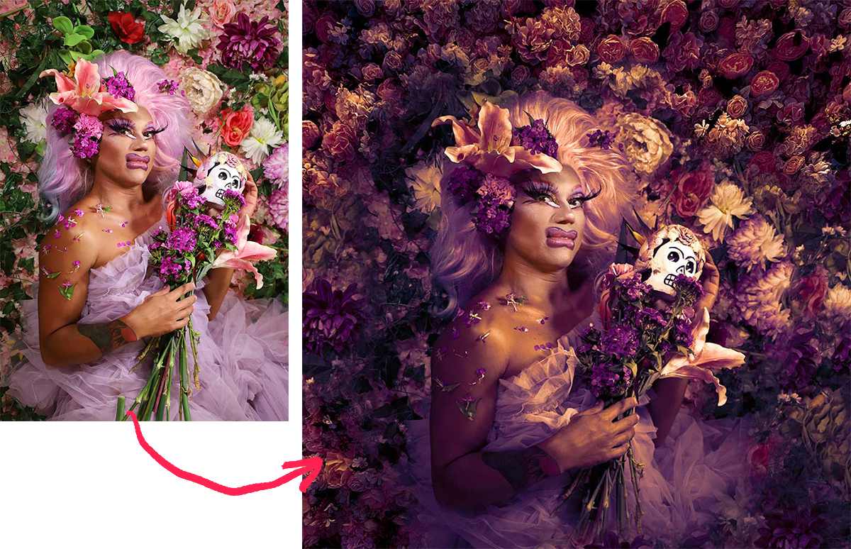
UltraMaroon

Season 4 Redesign

A new visual identity for a queer nightlife community

  • Visual Identity Design
  • Graphic Design
  • Branding
  • Project:
  • Ultramaroon Season 4
  • Software
  • Adobe Creative Suite
  • Role
  • Branding, Visual Design, Art Direction
  • Dates
  • September 2022 - October 2022
  • About Project
  • UltraMaroon is a Queer montly dance party and community space in NYC known for its currated selection of house music DJs. UltraMaroon’s mission is to deliver a fresh take on nightlife by focusing on quality music and community building. I had been involved in producing some graphics for social media the previous year but for its 4th year I was approached to do a full refresh of the visual identity and a comprehensive set of assets to be deployed across multiple platforms and the years events.
  • Project Goals
  • Refresh the visual idenity of UltraMaroon for the new season.
  • Create a cohesive set of assets, images, and motion graphics across media platforms.
  • Excite new and returning guests with a series of tech and social media interactions.

Audit

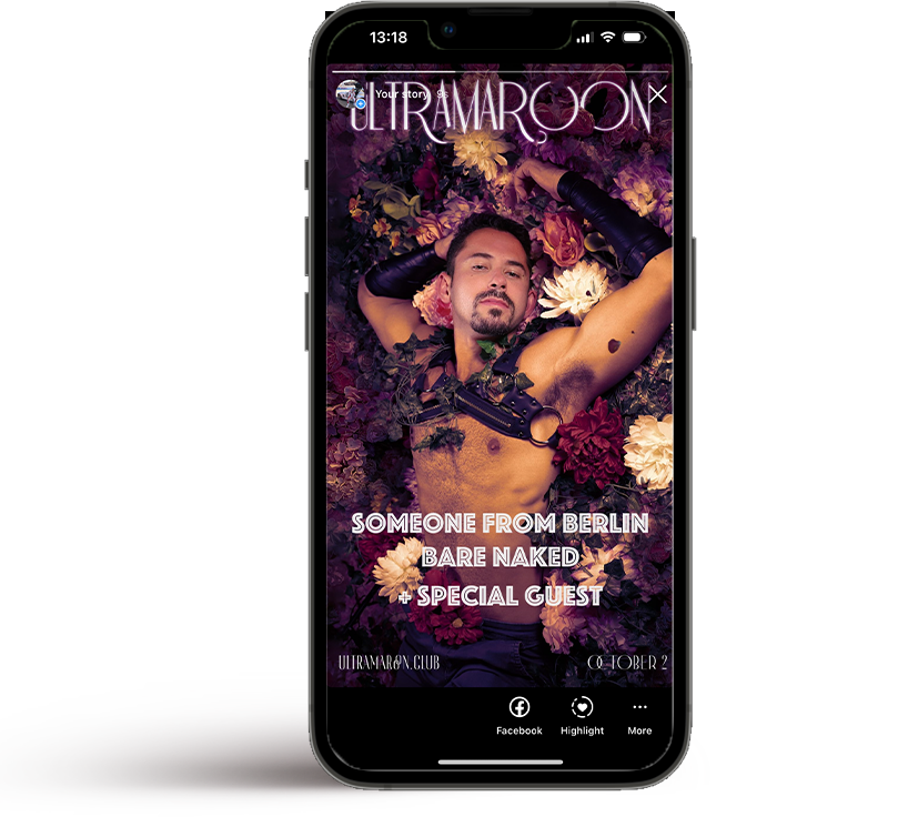
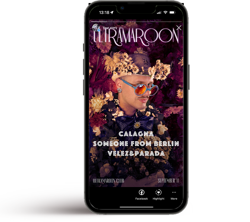
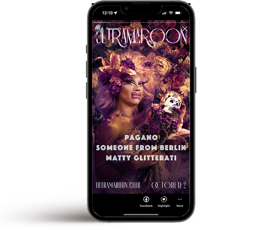
The original graphics produced for social media 3 years ago by the founding DJs had been unchanged ever since. They felt that a set of updated visuals could better represent what the party and community attending had grown into.
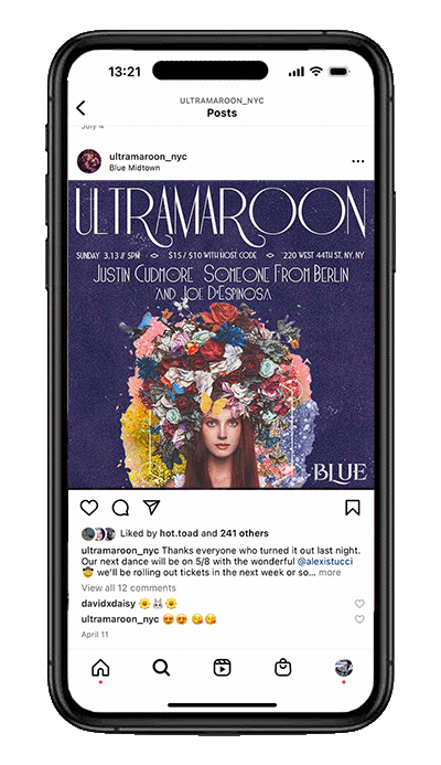
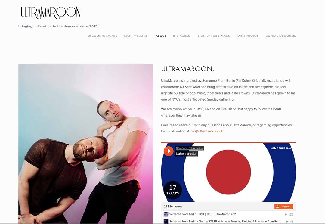
Exisiting Visuals

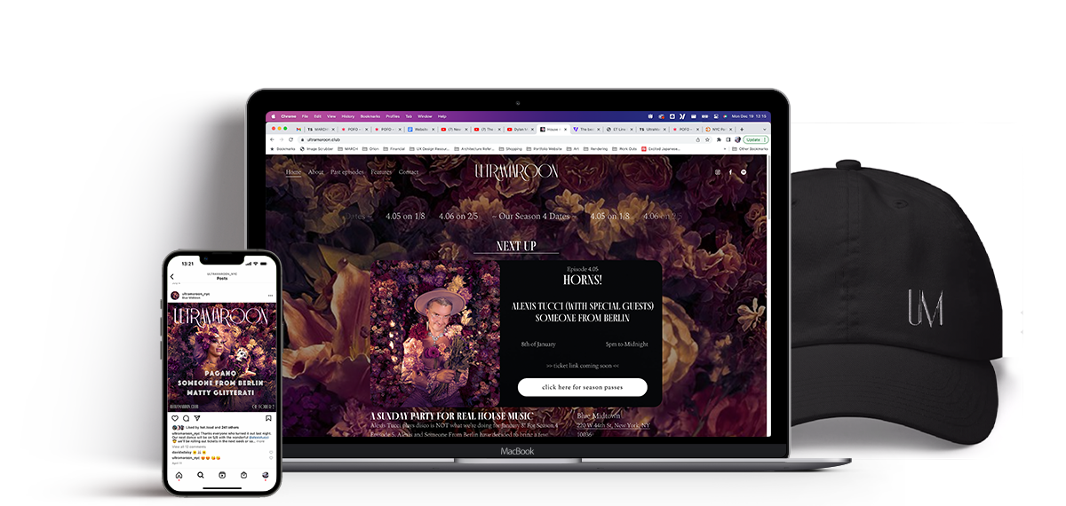
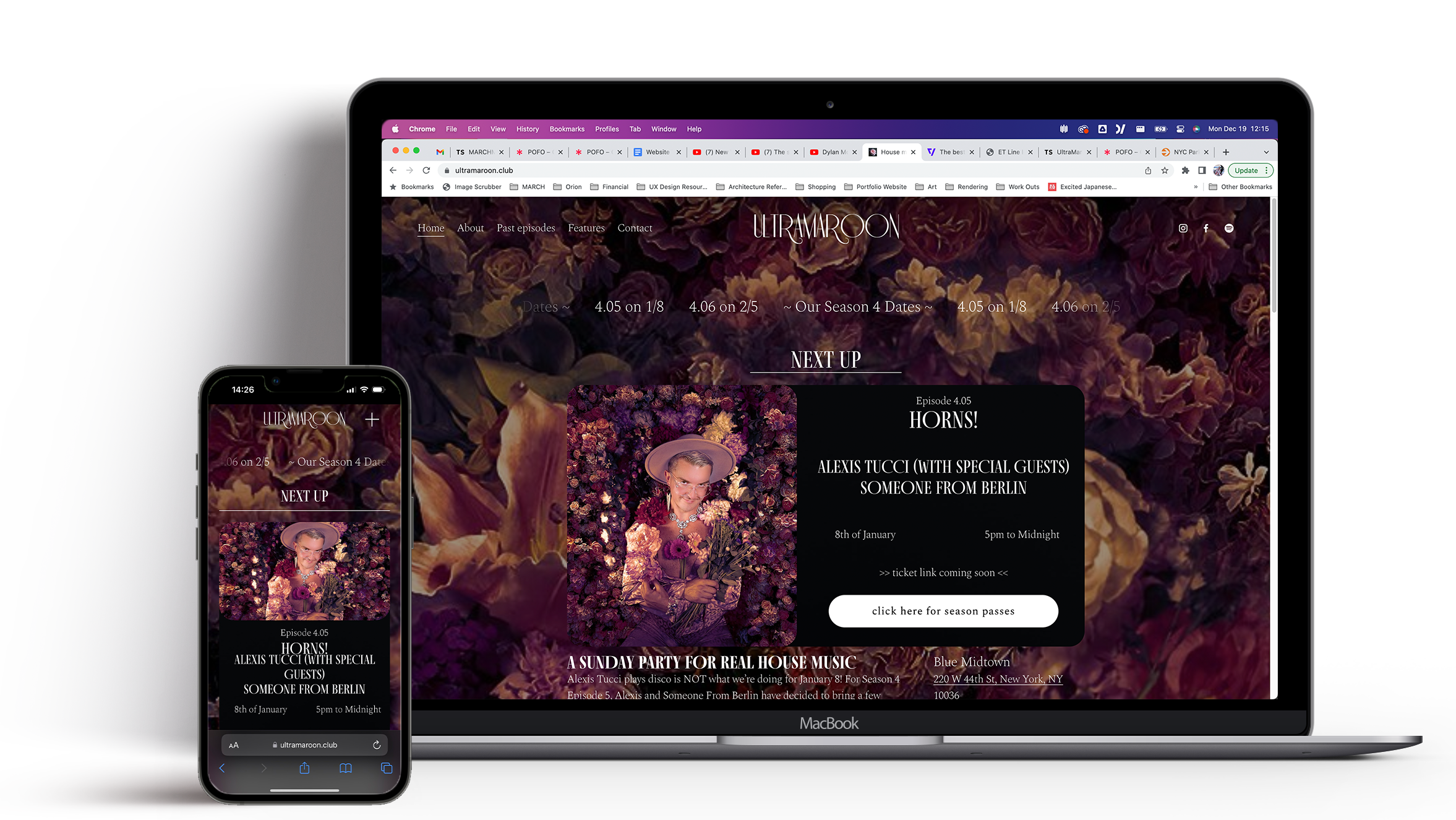
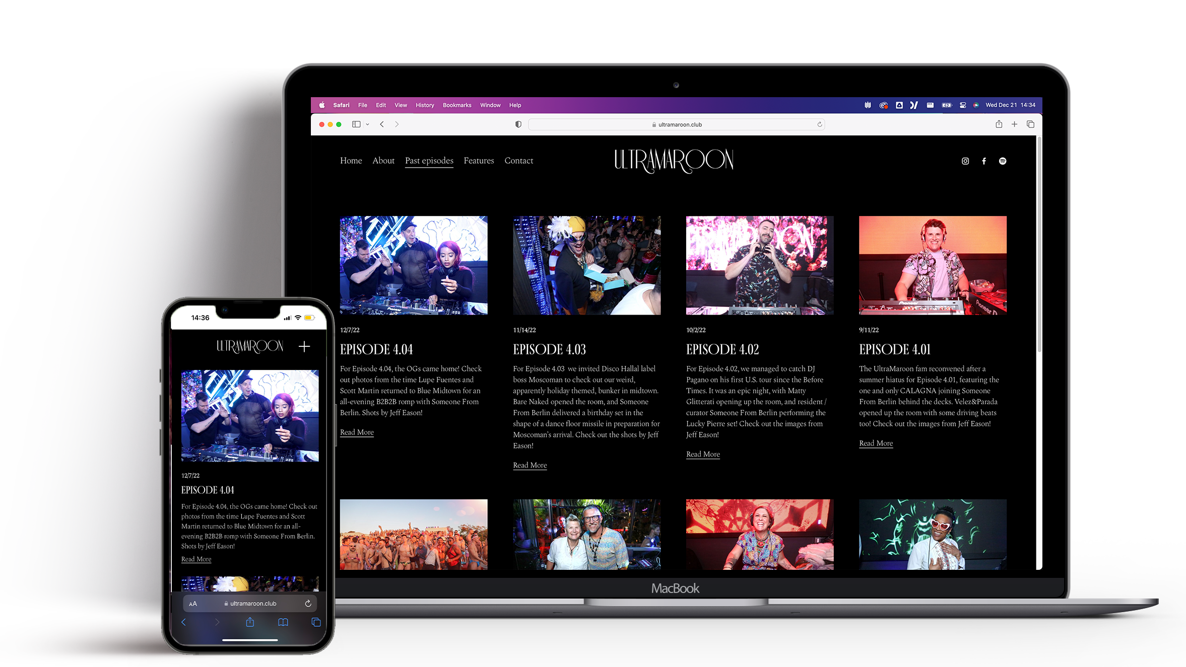
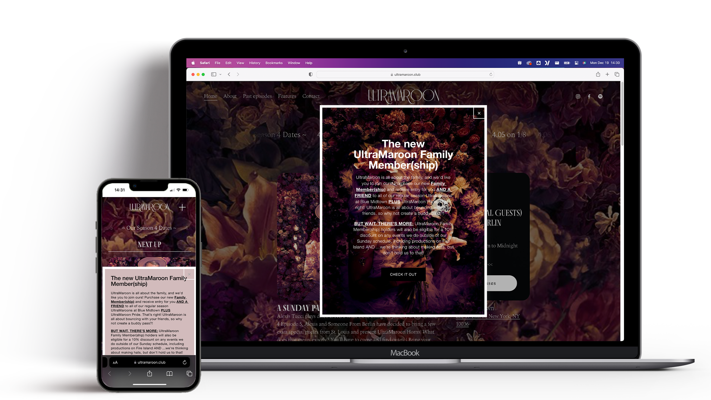
The social media presence and web presence felt largely disconnected from one another. The website was functional but didn’t look like the party felt and it was challenging to navigate to any information that wasn’t current. The social media images were low resolution and struggled to stand out in a crowded nightlife field.

instagram feed post showing previous ultramaroon design featuring a woman with flowers on her head and ultramaroon in large text across the top with DJ names below
previous website image
Who is already here?
400+
Monthly Guests
2276
Followers
56
Kikis Thrown
5678
Subscribers

Conceptualization

Vision Statement

UltraMaroon’s visual presentation should be as queer, dynamic, and welcoming as the sonic experience developed by its creators. There should be a cohesive visual identity across all of its output including social media, motion graphics, print media, merchandise and brand assets.

Specific Goals
Visual Tool Kit

How can this new set of tools work as a set of guidelines and approaches to allow for flexibilty as different needs arise?

Community Engagement

How can we make sure this refresh reflects the community of people already attending and invites new folks to join?

Multi-Media Flexibility

How can we make sure this new visual identity scales across the many types of media community members engage with?

What Do We Need?
  • Graphic template for social media posts
  • Video styles for social media stories
  • A new website
  • Brand style guide
  • A Logo
  • Graphics for merchandise
  • Print Media Templates
  • Mobile wallet passes for tickets
Find:
References

The exisiting soical media posts were using art deco and art nouveux elements, moving fowared I wanted to grow and expand on that style while differentiating it from other events in the area. The founder had been integrating a lot of floral elements into staging for events in the previous season and wanted to build on that as well.

 
What Color Is UltraMaroon?

While the name of the party suggested a color, maroon, 'ulramaroon' as a color wasn't defined yet. Reddish-purplish hues hadn't shown up in any previous visuals presenting an opportunity to play off of the name and define a unique palette. Exploring many shades we landed on one.

#5b0d4b

#75295e

#701a4f

#592751
this one

#5e2740

#4f1752

Bring In:
The Crü

Involving the people who create and work on UltraMaroon felt essential to this reimagining of the presentation of the party to the world. This happened both during the ideation and creational phases of the project but most directly perhaps its seen in the replacement of the previous visuals anonymous heads with flowers with those of the people most involved in the party. We organized a photoshoot and asked the dancers/door people/managers/hosts to come in whatever look they felt best described them. This photoshoot grew into the foundation of most of the final graphics.

Exploration

Having the needs identified and a conceptual groundwork laid I started collecting elements and exploring how they can all fit together. I was really interested in how ultramaroon might be a color or color space that could be defined and then utilized across assets to create cohesion. I also really wanted to integrate the people who created the party closely into the assets.

Photography

The party’s fantastic doorperson Kris is also an incredible photographer and we tapped him to shoot portraits of the UltraMaroon family to use in graphics. I wanted to replace the anonymous heads that had been used in the old graphics with the familiar faces that make the party happen and highlight those incredible people.

Exploring:
Color Application

The color defined as “UltraMaroon” was going to be used across the brand and color grading the photoshoot was a really exciting opportunity to explore how it can infuse and alter the work. I spent a great deal of time working to create a look and feel that felt as welcoming, luxe, and exciting as the people who come to and create the party.

 
Test of image colors
Photo Editing

Before and After

Defining:
Type and Logo

There wasn’t really an existing approach to type or a logo so I took the existing types that the creators really liked and expanded them into a more structured set of use standards. The existing ultramaroon title and logotype used a typeface called Riesling was maintained from the old design to keep some continuity and also because the client liked it. I replaced the body text with a larger more legible art deco inspired typeface called phosphate that would work across media types and highlight the most important information. Finally for subtitles and ancillary text I introduced a more delicate type called Made Cannes.

A major missing component was a logo. The Reisling tile “ULTRAMAROON” had been standing in as necessary but as things like merchandise and a more formal online presence became reality it was necessary. The idea of a monogram style logo made sense in the context of an art deco/art nouveau era inspired design.

 
Motion and Sound

I was really excited to level up the social media posts by introducing some motion and sound to them. I brought in various types of footage to layer on top of the photographic base and animated some of the text elements on larger formats. For sound each month the resident DJ picks a track to accompany the post that speaks to the line up playing that night.

Design Solution

The new current state of UltraMaroon’s graphic appearance reflects the dynamic, energetic, queer community that surrounds it. It is cohesive across its various media types and aligns with UltraMaroon’s mission to deliver a fresh take on nightlife by focusing on quality music and community building.

Final Still Image Assets

The final still image output graphics layered together the photography, new type and logos with some text and image retouching. Seeing the people that make UltraMaroon happen in the published work was really special.

Crew Image Stills
Social Media Stories
Responsive Website

Website evolved from a set of link and semi-regularly updated information to a fully featured responsive site that highlighted the next event and also was now able to host an easily accessed archive of photos from previous “episodes” as well as interviews with the various performers, djs, and hosts that make it all happen.

Selected Screens

 
  Home Screen
Past Episodes
Membership Modal
Video Coolness

The videos add a much more considered look to the public facing output of the party. Each month a member of the crew is featured across the collateral and the resident DJ “Someone From Berlin” selects a track to accompany it that speaks to the line up of DJ’s playing that night.

Click Speaker Icon for Sound
 
Mobile Passes

Phone wallet passes are created for people who purchases season passes through the familymember(ship). I added geofencing to the pass so they automatically surface as members arrive. I also added a color coding system to create another set of easily recognizable passes for people working the party.

 
Physical Output

The visual design is starting to leave the screen and make its way into the physical world as it expands alongside the aspirations of UltraMaroon. Beyond simple menus and flyers, merchandise like hats, shirts, and sweaters are in the works.

Next Steps

UltraMaroon still has half a season ahead of it this year and isn't planning on slowing down any time soon. The community has responded extraordinarily positively to the new look and feel of the party and have pitched all sorts of ideas about where to take it forward.

+

Launch Branded Merchandice

+

Live Motion Graphics for Events

+

Expand Nightlife Safety Information Sharing

+

Start Ideation For Next Season


  • Impact
  • The news tools allow for a cohesive visual language, and bring recognition across all of UltraMaroons output. The community has responded by engaging more with posts, asking for physical merchandise and buying season passes.
  • What I learned
  • Building up the design and breaking it down into a kit of parts model was a really useful process to find gaps and inflexibilities in the volume of work. I would use this approach again in the future to validate work even when it wasn’t going to be utilized this way. It was also incredibly gratifying to work directly with the people who create and work on this party to showcase them in the work itself, they lent new ideas and perspectives that added so much strength to the larger vision of the work.

Thanks for exploring my project!