
TICKT
A service that streamlines finding and purchasing movie tickets for groups of people ensuring they can sit together.
- UX Design
- Branding
- Graphic Design
A service that streamlines finding and purchasing movie tickets for groups of people ensuring they can sit together.

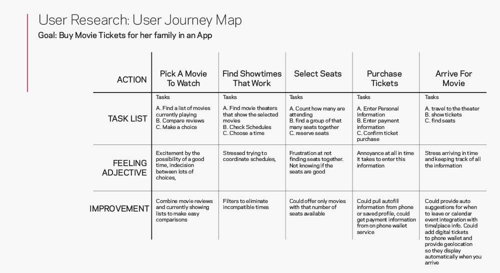
I started the research for this app interviewing a broad sample of people to understand how they used mobile ticket apps and what issues or pain points they had. I then built out empathy maps, user personas, and large scale/small scale storyboards to process that information and direct my design.
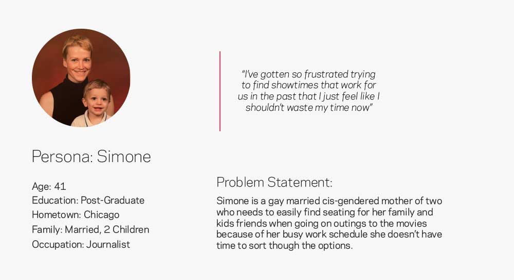
I conducted interviews with friends, family and coworkers to understand what pain points they experienced when purchasing movie tickets. I then used that information to create empathy maps to better understand these users. An insight that I gathered from this was that people were frequently frustrated when trying to purchase tickets for their family or groups of people, more specifically because they couldn’t see what seats were available until far into the process.
This was a new pain point that I hadn’t considered going into this project and it redirected the design moving forward to focus on this group of users specifically.
It takes too long to go though each showtime option to find seating that works
Apps are cluttered with ads and its difficult to find what users are looking for
Most sites don’t have a place to define accessibility needs before finding tickets

I worked through paper wireframes, sketches, and then digital wireframes to find a user flow that addressed the pain points I identified in the research and stayed simple and easy to understand.
Each of these homescreen iterations for the app helped clarify what information would be most useful to users up front and what clutter could be removed to help streamline the process. I tried to ensure it was as fast as possible so users didn’t have to search through options to find the information they needed.
The digital wireframe translated the ideas from the paper sketches into a more defined set of standards. I also honed in on a sequential series of screens to guide users through the information in a simple 3 step process.
The low fidelity prototype let me do some initial testing with users and I iterated a few times testing out different information orders to see what would be easiest for the user.
The low fidelity prototype was tested with 6 users to get feed back and find issues in the main purchase flow. I asked them to try and buy a ticket in the prototype and recorded them to get feedback to use in the next round of design iterations.
"I'm missing the total cost or some sort of receipt before i've paid and I want to know about any fees up front"
"I really wish the seat info was shown before now"

After the first round of interviews with users I incorporated their feelings, observations, and comments into a revised design and took the wireframes to a higher level of fidelity before testing them again.
The high-fidelity prototype took users through the total movie search and checkout process as well as updated the navigation to a bar with access to user profiles and purchased tickets to address user feedback.
Refined Prototype


The first usability study highlighted that users wanted more information earlier in the buying process to more easily compare their options. Since this app is really focused on streamlining the process by centering the seating experience I moved that information to the search results page as well as showing if there were multiple options in a screening.
Usability studies showed that there was missing information during the payment process and users weren’t shown a final cost or a breakdown. The updated payment page added this information and made it clearer to the user what final costs were before they confirmed.
Included movie posters to help users find selections more easily and visually.
Options added to ensure wheelchair accessible seating is available
Pages are optimized to keep information organized and easy to navigate with screen readers

There are several other features that were part of the ideation phase that didn’t make it into the current iteration of the design. I’m looking forward to returning to this project in the future and revisiting it to add or expand on these.