
Pet Foodie
A responsive webpage design to help users modify an exisiting delivery pet food subscription.
- UX Design
- Responsive Design
- Graphic Design
A responsive webpage design to help users modify an exisiting delivery pet food subscription.

I started this project by interviewing people who use or had used subscription pet food services to understand their needs and frustrations. I also asked about a wish list of things to improve their services. In my survey of other offerings I found that subscription services are still a relatively new option in the pet food market so while there aren’t many competing companies there are a wide range of approaches.
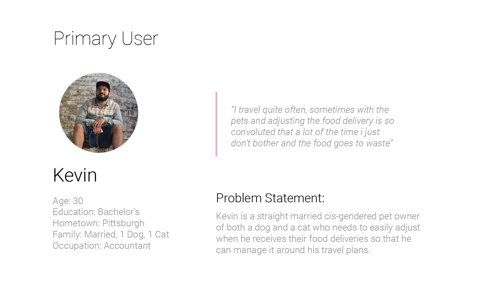
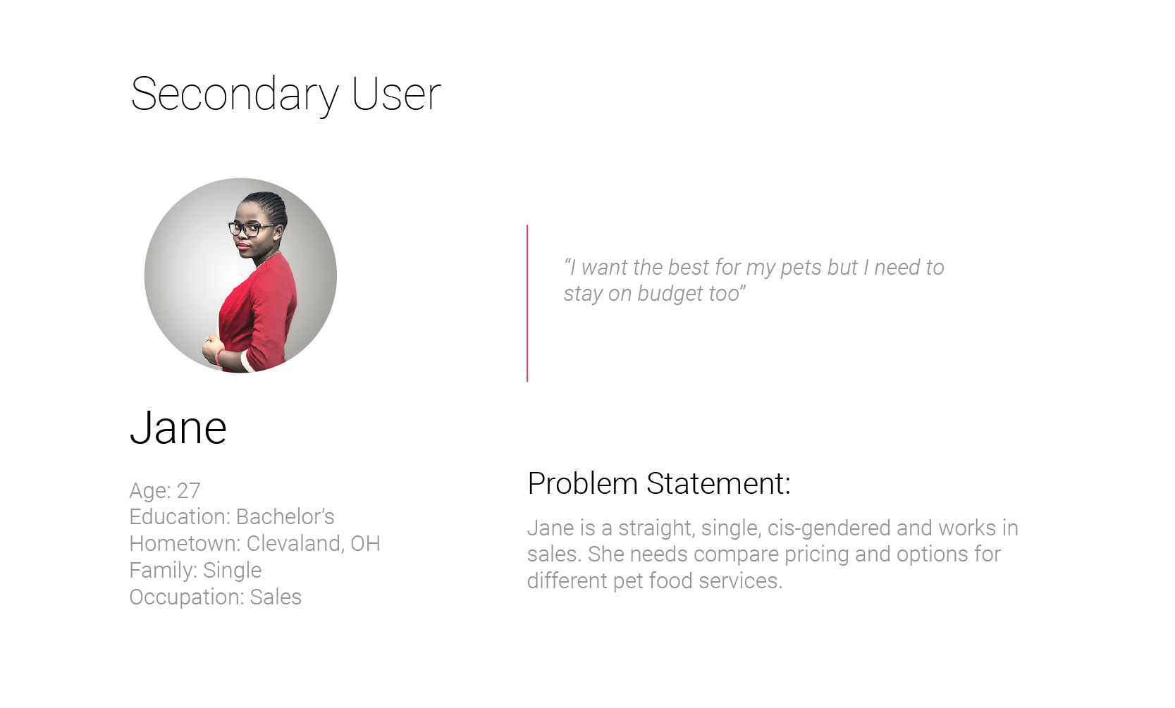
I conducted interviews with friends and coworkers to find out which ones currently or had used pet food subscriptions in the past and what pain points they experienced. I then used that information to create empathy maps to better understand these users. An insight that I gathered from this was that people were frequently frustrated when trying to make temporary changes or change amounts and timing of food deliveries.

I started this project by interviewing people who use or had used subscription pet food services to understand their needs and frustrations. I also asked about a wish list of things to improve their services. In my survey of other offerings I found that subscription services are still a relatively new option in the pet food market so while there aren’t many competing companies there are a wide range of approaches.
Users have a hard time finding the modifications they want to make to their subscriptions or they didn't exist.
Many services hide or limit the option to downgrade or cancel subscriptions.
Some subscriptions did not have places to specify whether pets had allergies or special dietary restrictions.

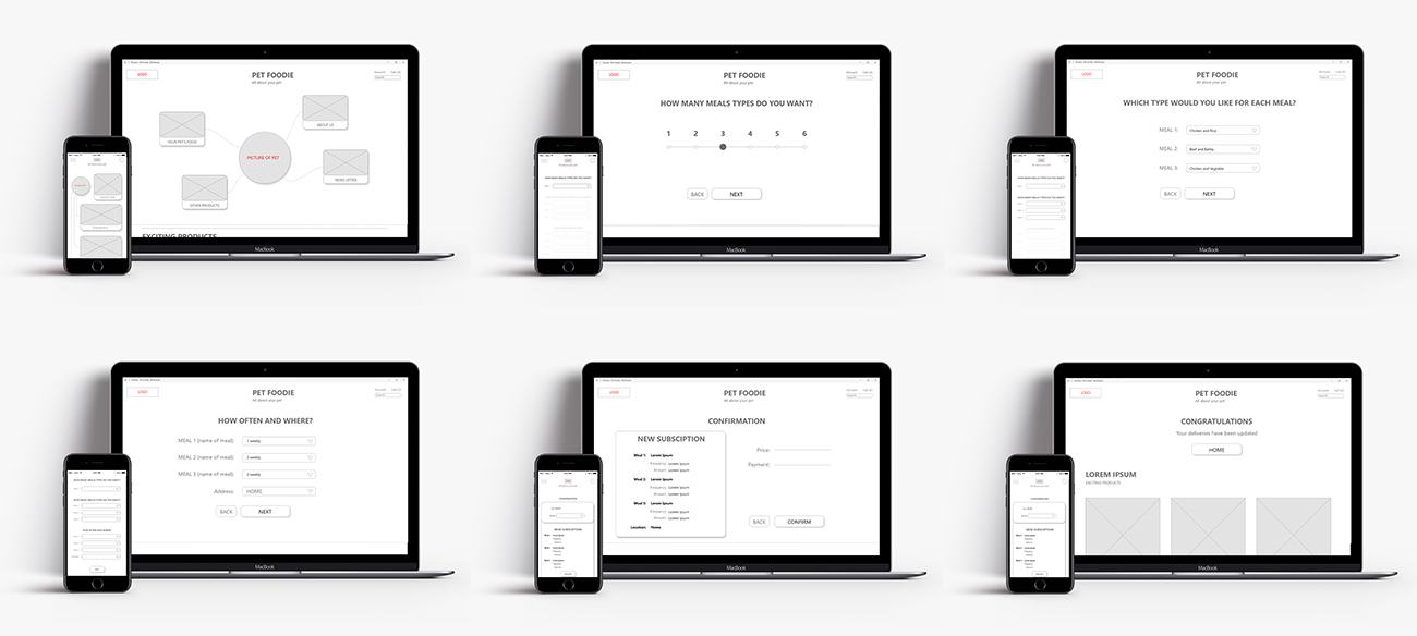
Although the focus was on the users journey managing their pet food subscription I also had to design a homepage that would support it. I quickly iterated through paper and digital wireframes and then transitioned to a low fidelity prototype that I could test and get initial feedback on.
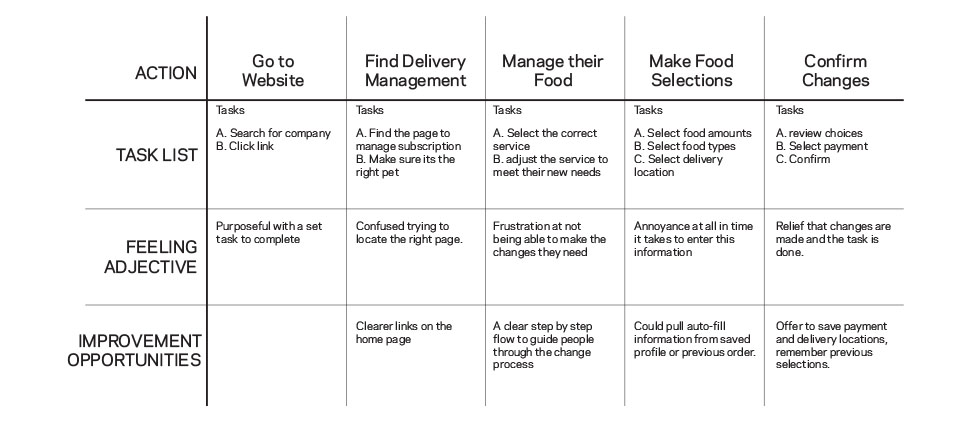
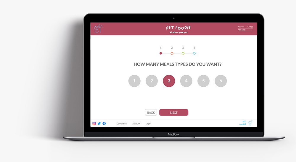
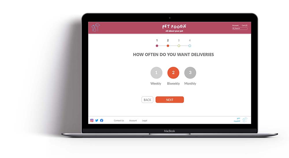
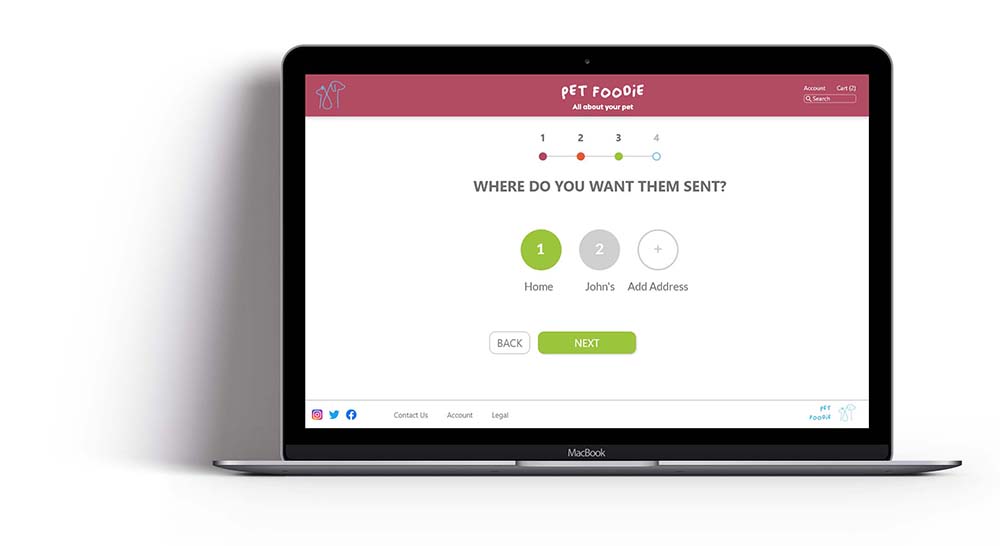
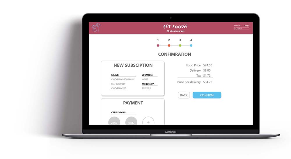
The site map off of the homepage was set up in a hierarchical way however because of the number and combination of options when users were editing subscriptions it made sense to create a sequential branch that would guide users through the process and present them with information in an ordered manageable way.
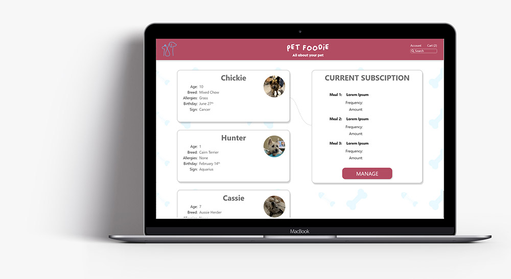
Placing the users pets at the center of the experience became the driving concept of the design as I iterated through paper wireframes on the home page and the user flow to manage the subscription.
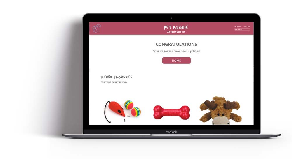
The digital wireframe refined the concept centering users' pets in the experience. Various links float around the avatar of the user's pets providing easy access to things like subscription management, education information, and additional products like toys and accessories. During the delivery management flow, users are presented with a series of questions in sequence to keep the web of options simple to navigate on a per pet basis.
After creating a prototype from the low fidelity wireframes, I conducted a useability survey of 5 people to test it. I asked them to go through the subscription management user flow in the prototype and recorded their interactions and impressions to get feedback to use in the next round of design iterations.
"I would want to be able to manage multiple pets with different subscriptions but I really like how focused it is on the pet."
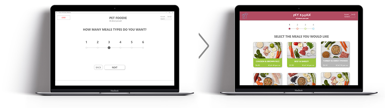
The first usability study highlighted that users felt the homepage was empty and didn’t easily understand the floating links around the central pet avatar. Users really wanted to know how many steps there would be and how long it would take. In the revision a progress bar was added. Button and options on the page were made larger and more friendly.
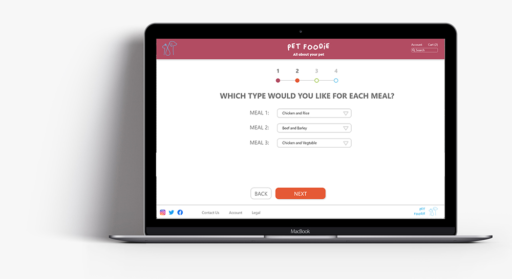

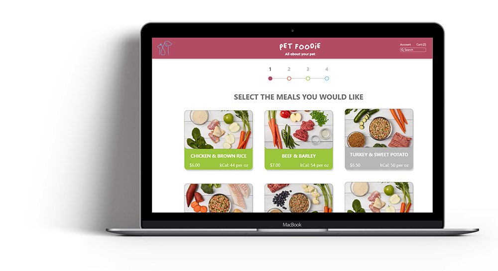
The final design responded to another round of user testing, users wanted more information about meal types and I felt that there were still more places for improvement in the way the quiz was working.
In this iteration of the design the drop down menus were replaced with buttons that felt the same across all screens and were easier to interact with. These could be contextualized to users accounts and saved preferences to surface saved information like payment types and delivery addresses.
Refined Prototype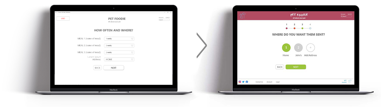
The design uses large and labeled buttons to make them easier to access with assistive devices.
Management options are layed out in a repetitive single column in a linear progression to make it easier to people with reduced vision to navigate.
Pages and interactions are clearly and consistently labeled.

As a pet owner myself I really enjoyed getting to interview people and talk about their favorite furry roommates. While centering the user is always core to my design practice it was fun considering pets as a central part of the design process as well. Big thanks to my friends for letting me use their pets likenesses in the mock-ups and putting up with my constant inquiries.